Have you ever spent hours creating a document, poster, school project, or presentation, only to discover that the final result does not look quite right when you print it? Maybe the text feels cramped, important information gets pushed onto another page, or the design looks completely different from what you saw on your screen.
Often, the problem is not the design itself. It is the paper size.
Paper size might seem like a small technical detail, but it can have a surprisingly big impact on how your work looks and how easily people can use it. Whether you are preparing a school worksheet, printing a business proposal, designing a flyer, creating a portfolio, or putting together a classroom project, choosing the right format at the beginning can save you time and frustration later.
The good news is that you do not need to be a professional designer to make the right choice. Once you understand what the common paper sizes are designed for, selecting one becomes much easier.
Table of Contents
ToggleStart With the Purpose of Your Project
Before opening your design software or hitting the print button, ask yourself one simple question: What is this document supposed to do?
A paper size should support the purpose of your project rather than dictate it.
For example, imagine you are preparing a three-page research assignment for school. You will probably want a familiar size that provides enough space for paragraphs, headings, diagrams, and references. On the other hand, if you are creating a small invitation for an event, a full-sized sheet might feel unnecessarily large.
The same principle applies to professional projects. A business report needs to be comfortable to read and easy to store. A promotional poster needs enough visual space to attract attention from a distance. A small instruction card needs to be compact enough to carry around.
Thinking about the final use first makes the rest of the design process much simpler.
Why A4 Is Such a Common Starting Point
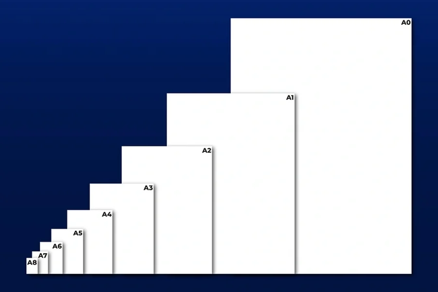
For many everyday projects, A4 is the format people encounter most often. It is widely used for documents, school assignments, office paperwork, letters, reports, forms, and many other printed materials. Under the ISO 216 standard, A4 measures 210 by 297 millimetres, or 21 by 29.7 centimetres.
If you have ever wondered what size is a4 in cm, those measurements give you a useful mental picture: it is roughly the size of a standard sheet you might use in a home or office printer.
A4 is particularly useful because it offers a comfortable balance. There is enough room for detailed content without making the document feel oversized. It also works well with common printers, scanners, folders, and filing systems.
Imagine a student preparing a science report. On A4, they can combine written explanations, charts, photographs, and diagrams without making everything feel squeezed together. A teacher can print the report easily, and the finished pages can be placed in a standard folder.
That practicality is one reason A4 remains so useful even as more work moves online.
When A3 Gives Your Ideas More Room
Sometimes A4 simply is not enough.
This is where A3 can be useful. At 297 by 420 millimetres, A3 provides roughly twice the area of A4. The A-series is designed so that each size relates proportionally to the next, making it possible to scale designs between formats without changing their overall shape.
A3 is particularly helpful when your project depends on visual information.
Think about a student creating a presentation board about climate change. An A4 page may be fine for the written research, but an A3 sheet could provide enough space for a large infographic, timeline, photographs, and key statistics.
The same applies to professionals. Architects, marketers, teachers, and event planners may use larger formats when they need information to be visible from a distance.
A useful rule is simple: if your project contains several visual elements that need to breathe, consider moving up a size.
A5: Small, Portable, and Surprisingly Useful
Going in the opposite direction, A5 is half the area of A4 and measures 148 by 210 millimetres.
A5 works well when portability matters.
You might use it for a small notebook, event programme, booklet, personal planner, menu, or information leaflet. It can also be useful for educational materials where students need a quick reference sheet rather than a full-sized document.
For example, imagine a teacher preparing a revision guide for students. Instead of handing out several full-size pages, they could design a compact A5 reference booklet containing formulas, vocabulary, definitions, or study reminders.
This is also where thoughtful design becomes important. Smaller paper does not simply mean shrinking everything down. Font size, spacing, margins, and image placement all need to be adjusted so that the content remains comfortable to read.
Do Not Forget About Digital Design
One of the biggest changes in modern project creation is that many documents begin their lives on a screen rather than on paper.
Students might create assignments in online editors. Businesses may design brochures in cloud-based applications. Teachers can prepare interactive worksheets and presentations using digital platforms. Designers can create a poster entirely on a laptop before sending it to a printer.
This means choosing a paper size is no longer only a printing decision.
Digital design tools allow you to select dimensions, switch between portrait and landscape layouts, resize elements, and preview how a project may look before you print it. That can make the process much more efficient.
Technology has also changed the way students learn. A learner working on a history project might research information online, collect photographs, create a timeline digitally, and then turn that material into a printed A3 presentation. The physical page becomes the final stage of a much larger digital workflow.
Instead of treating technology and paper as competing alternatives, it is often more useful to see them as connected parts of the same process.
Think About How People Will Read It
Paper size should also reflect how your audience will interact with the finished project.
Will someone hold it in their hands? Will it sit on a desk? Will it be displayed on a wall? Will several pages be placed inside a folder?
These questions can completely change your choice.
A long report might work well in portrait orientation because readers naturally move down the page. A comparison chart, timeline, or wide table might work better in landscape orientation.
For example, suppose you are preparing a classroom worksheet containing a large table comparing different countries. A portrait page could force you to make the columns narrow, resulting in tiny text. Turning the page sideways could give each column enough space to remain readable.
Sometimes you do not need a different paper size at all. You simply need a different orientation.
Pay Attention to Margins and Printable Space
A common mistake is designing right up to the edges of the page.
Printers often need a small area around the edges, and some cannot print completely to the edge unless they support borderless printing. This means the actual usable area of your page can be smaller than its official dimensions.
Give your content some breathing room.
Margins are not wasted space. They help separate the content from the physical edge of the paper and make a page easier to read. They also give you some protection against minor printing differences.
This becomes especially important when creating certificates, invitations, posters, or other designs where positioning matters.
Consider the Final Printing Method
Before settling on a format, think about where and how the project will be printed.
A document designed for your home printer may have different requirements from one being professionally printed. If you are sending a project to a print shop, check whether they have specific requirements for bleed, margins, file formats, or dimensions.
It is also worth checking the printer settings before printing a large batch.
A surprisingly common situation is designing an A4 document and accidentally printing it on a different format, causing content to be reduced or cropped. A quick preview can prevent an entire stack of wasted paper.
For important projects, print one test page first. Look at it physically rather than relying only on your computer screen. Something that looks perfectly balanced digitally can feel too small or too crowded once it is in your hands.
Choose the Size Before You Start Designing
One of the easiest ways to make your life harder is to choose the paper size at the end.
Imagine spending two hours designing a detailed poster on a canvas that is too small. You then decide that it needs to be larger. Suddenly, text boxes move, images need repositioning, and the whole layout becomes messy.
Choosing the format at the beginning gives you a fixed framework to work within.
A simple workflow can help:
- Decide how the finished project will be used.
- Choose the paper size and orientation before adding detailed content.
Then build your design around that framework. This is particularly useful for students, because it encourages them to think about presentation and communication rather than simply filling a page with information.
Use Technology to Experiment
Modern design software makes experimentation much easier than it used to be.
Instead of guessing whether A4 or A3 will work better, create a rough version in both formats. Look at how much room your content needs. Try portrait and landscape versions. Move your images around. Reduce unnecessary text. Increase spacing.
You can often discover the right format simply by comparing a few rough layouts.
This approach is especially valuable in education. Students can learn through trial and error: create a digital poster, review how readable it is, change the layout, and see how those changes affect the final result.
In other words, the software is not simply helping them make something attractive. It is teaching them to make decisions.
The Right Paper Size Is About Communication
Ultimately, paper size is not really about numbers.
It is about communication.
A good format makes your message easier to understand. It gives important information enough space, guides the reader through the content, and makes the finished project feel intentional.
A student report, for instance, should make research easy to follow. A poster should make its main message visible quickly. A brochure should encourage people to explore the information. A worksheet should give learners enough room to interact with the material.
Once you start thinking this way, choosing paper size becomes much less intimidating.
Final Takeaways
The next time you begin a printed or digital project, resist the temptation to immediately start adding text and images. Take a moment to think about the finished product.
Consider the purpose, audience, amount of information, visual elements, printing method, and whether people will read the project up close or from a distance. Then choose a format that supports those needs.
For everyday documents, A4 will often be a practical starting point. A3 can give visual projects more room, while A5 can make smaller materials easier to carry and distribute. But there is no universal answer. The right choice depends on what you are trying to communicate.
Most importantly, use technology as part of the decision-making process. Digital tools give you the freedom to experiment before committing to paper, helping you find a layout that works in the real world.
A sheet of paper may look simple, but the format you choose can influence how your entire project is experienced. Choose it thoughtfully, and your design will already have a stronger foundation before you even write the first sentence.